Native mobile · Toggl Track · iOS + Android
A core mobile interaction, redesigned from the inside out.
Simplifying the timer without simplifying away what mattered.
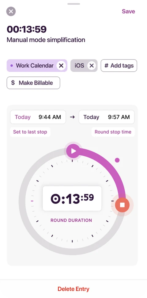
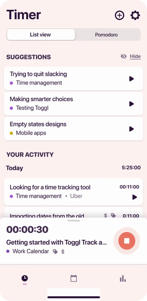
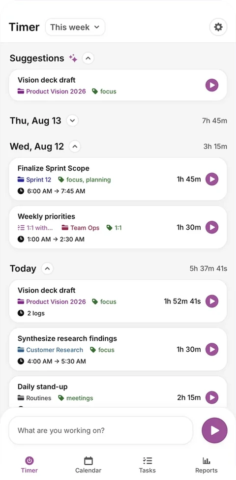
I redesigned Track’s core timer experience across iOS and Android — reducing a dense edit sheet to the things people actually needed, while keeping the interactions experienced users relied on.
- from 27,000+ ratings
- 4.8 App Store rating
- from 26,000+ ratings
- 4.6 Google Play rating
Role
Sole product designer
Timeline
Mar 2025 – Jan 2026
Team
PM Tech lead iOS + Android engineers Design lead
Scope
Research → flows → UI → release + follow-up
In short
- The brief
- Simplify Track’s mobile timer without losing the functionality people depend on.
- The approach
- Audited the existing experience, tested broader mobile concepts, and narrowed the work to the core timer.
- What I designed
- Automatic, Manual and Duration-only flows, with a cleaner edit sheet, simplified duration wheel and fewer competing actions.
- What changed
- A dense edit sheet became simpler Automatic, Manual and Duration-only flows, with a cleaner wheel and fewer competing actions.
What shipped
The edit sheet, from the old one to the corrected one.
Process
One sheet. Prioritised, researched, redesigned, shipped, corrected.
More case studies
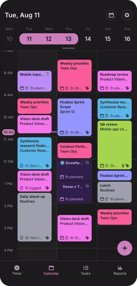


Work gallerySole designer for the first versions of the brand-new mobile appMobile · 0 → 1
Case studySometimes the right move is to change the question.Product design · originator, then advisor
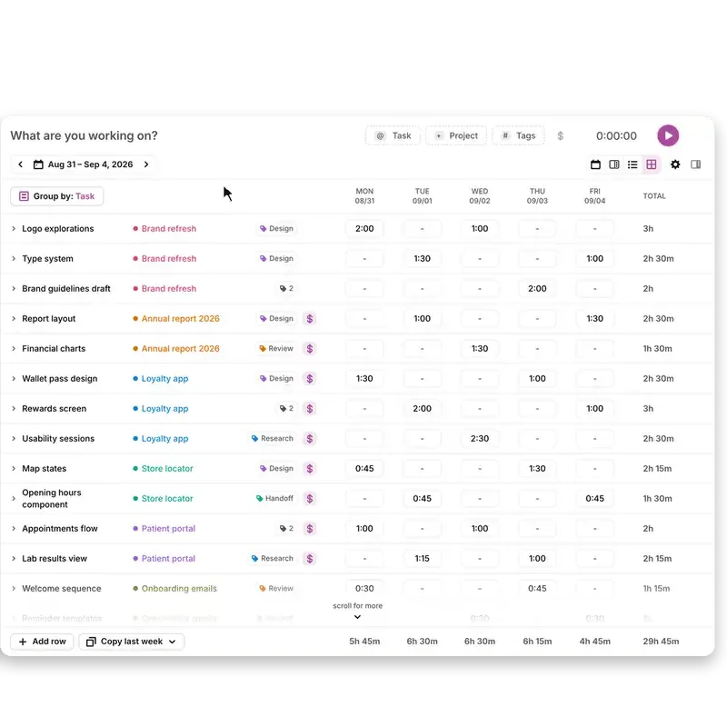
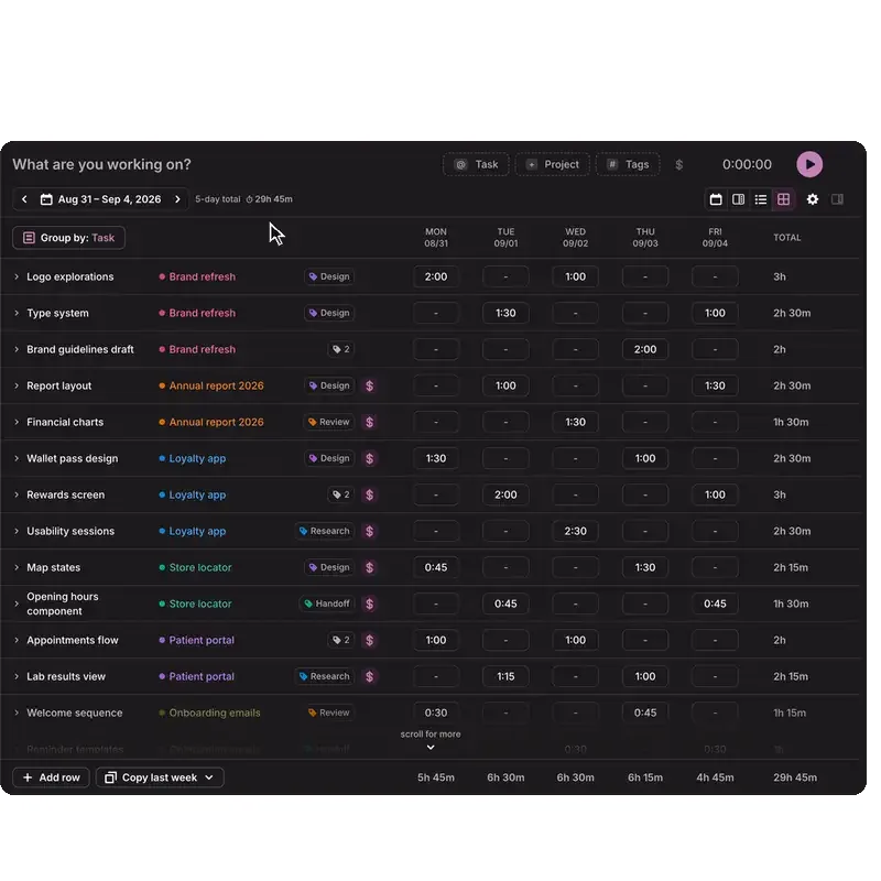

Case studyThe timesheet kept getting more complicated. The interface didn’t have to.Product design · continuous ownership
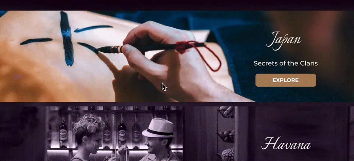

Case studyThe hotel already had the trust. The website didn’t.Web design · hospitality